Colors are a crucial component of graphic design, playing a vital role in evoking emotions and conveying messages. A thoughtfully chosen color palette not only enhances the aesthetics of a design but also influences how it is perceived and understood by the viewer. Understanding color theory can significantly help designers make informed decisions, ensuring their work is both appealing and effective.
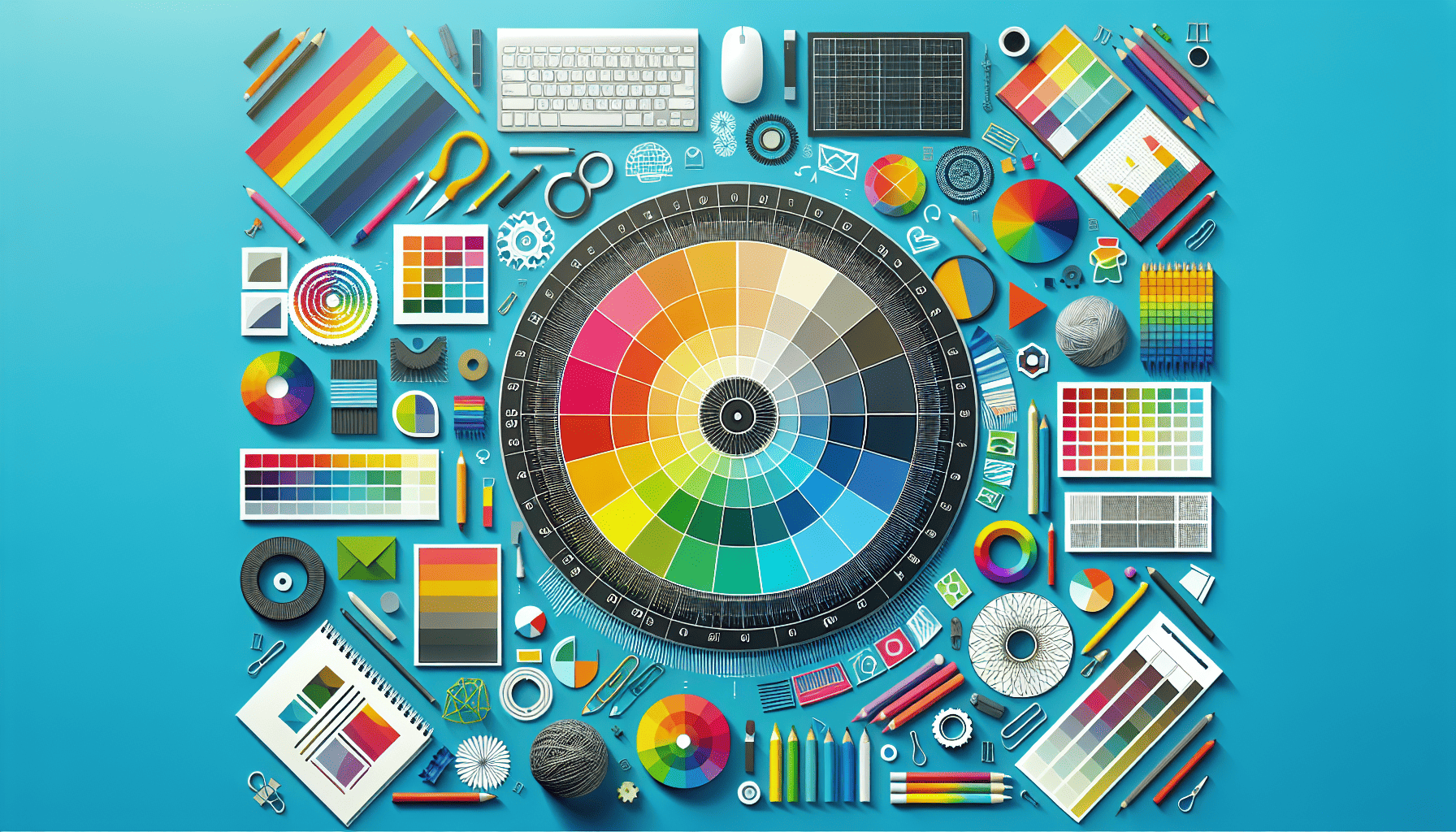
At the heart of color theory is the color wheel, a visual representation of colors arranged according to their chromatic relationship. The basic color wheel comprises of primary colors (red, blue, and yellow), secondary colors (green, orange, and purple), and tertiary colors, which are combinations of primary and secondary colors. A grasp of how colors interact on the wheel can guide designers in creating harmonious palettes.
One of the fundamental elements of color theory is the classification of colors into warm and cool categories. Warm colors, such as reds, oranges, and yellows, often evoke feelings of warmth, passion, and energy. Conversely, cool colors like blues, greens, and purples tend to create a sense of calm, serenity, and professionalism. Choosing between warm and cool palettes can be crucial depending on the message or mood a project aims to convey.
The emotional impact of color cannot be overstated. Colors have the power to influence perceptions and emotions on a subconscious level. For instance, red can evoke excitement and urgency but can also imply danger, making it suitable for call-to-action buttons or warning signs. Blue, often associated with trust and stability, is frequently used by financial institutions and corporations. Green, symbolizing nature and growth, is a popular choice for brands promoting sustainability or health. Understanding these associations aids designers in selecting colors that align with the emotional tone of their projects.
Color harmony is another vital aspect of color theory. Harmonious color combinations are aesthetically pleasing and can be achieved through various schemes, such as complementary, analogous, and triadic palettes. A complementary scheme involves pairing colors opposite each other on the color wheel, producing a high-contrast, vibrant effect. In contrast, analogous schemes use colors adjacent to each other, resulting in a more subdued, cohesive look. Triadic color schemes, formed by evenly spacing three colors around the wheel, offer a lively yet balanced palette.
Beyond aesthetics, color choices can also impact a project's accessibility. It's essential to consider color contrast and the experience of viewers with color vision deficiencies. High contrast between text and background ensures readability, while alternative text or pattern schemes can serve as cues for distinguishing elements in a design.
Incorporating the principles of color psychology and theory doesn't necessarily mean adhering to strict rules. Designers are encouraged to experiment and find unique combinations that resonate with their project's goals and target audience. Testing palettes across medium formats and context can provide valuable insights into how color choices perform in real-world applications.
Ultimately, the role of color in graphic design extends far beyond mere decoration. Through an understanding of color theory and mindful selection of palettes, designers have the power to craft compelling narratives and meaningful connections with their audiences. Whether aiming to provoke an emotion, communicate a message, or strengthen brand identity, color remains an indispensable tool in the designer's arsenal.
